
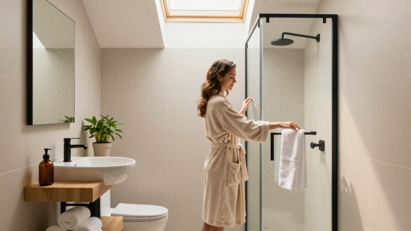
In a studio of just 15 m² in Paris’s 13th arrondissement, the wet room refurbishment topped the priority list. Space was painfully tight and the fittings were dated and awkward to use. An interior design team stripped the tiny build area back to basics and reworked it from the ground up-showing just how much comfort is possible, even in the smallest footprint.
From problem space to feel-good zone
Before the work began, the compact wet room felt more like a stopgap than a proper bathroom. It came across as gloomy, cramped and makeshift. The look and usability matched that impression: closer to a storage cupboard with plumbing than a place you’d choose to start your day.
The key issue was the layout: the shower and the WC were practically on top of each other. To shower, you had to lower the toilet seat and switch on the shower head directly above the pan. There was only a miniature basin, and storage was essentially non-existent.
"What had been a purely functional space with no atmosphere became a considered, modern retreat that genuinely welcomes the resident."
To achieve that transformation, the design studio relied on two main levers: a completely rethought layout and carefully chosen, compact sanitaryware.
Smart planning for a mini bathroom: every centimetre counts
In very small bathrooms, the positioning of the WC, basin and shower is the difference between a room that works and one that irritates every day. That’s exactly where the team focused its efforts.
The basin moves into the corner
Instead of keeping the washstand in a central position, the vanity unit was shifted into a corner. That simple move released valuable centimetres that had previously been wasted. With a slimmer piece of furniture in place, there was now room for a wall-hung WC with a concealed cistern.
- Basin placed in the corner to open up the circulation space
- Wall-hung WC to keep more of the floor area visible
- Slim shower screen, tailored precisely to the room
- Compact heated towel rail serving as both heating and drying solution
The sanitary modules come from ranges designed specifically for small floorplans: a narrower shower screen, a slim vanity unit and a space-saving heated towel rail. The selection underlines how many options the market now offers for mini bathrooms-if you search with intent.
A defined shower area instead of wet-room chaos
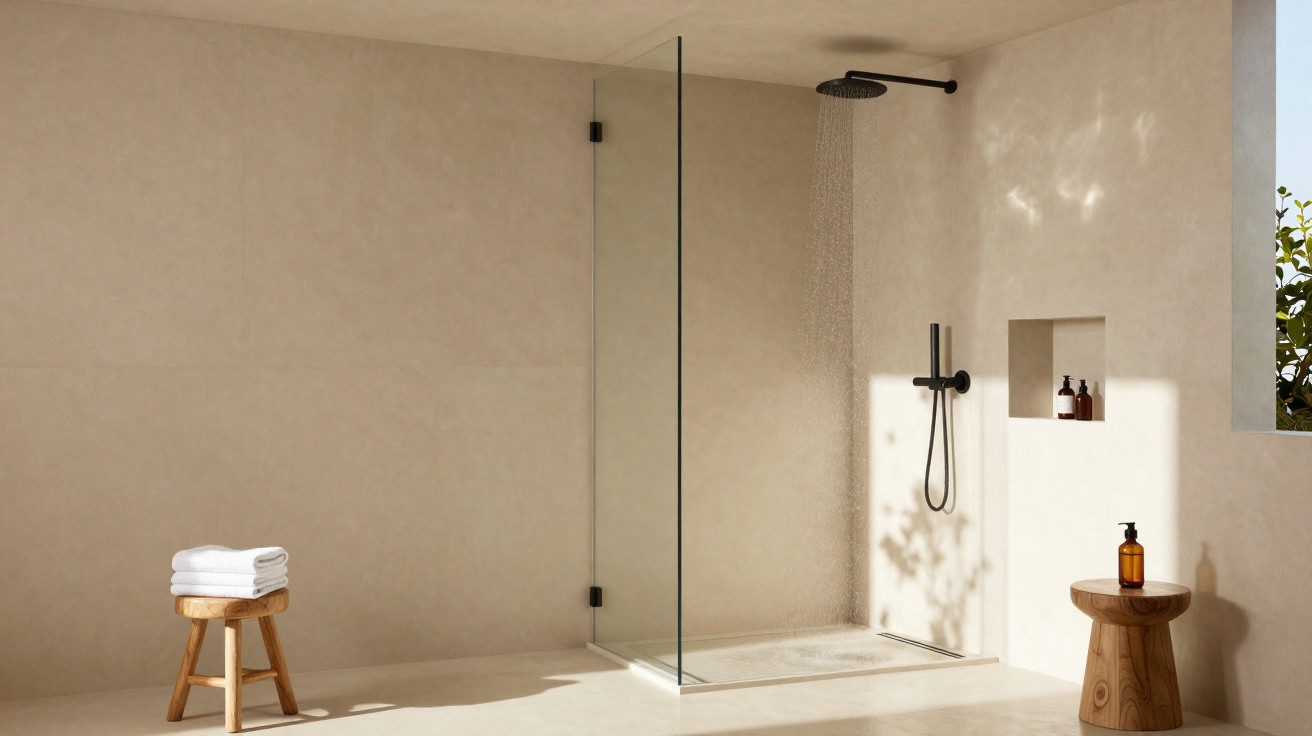
The biggest change is obvious: the shower and the WC no longer function as one combined zone. The new shower has a clearly defined enclosure with glass and profiles, so you’re no longer standing on tiles directly in front of the toilet. It doesn’t just feel more hygienic; it’s also psychologically more relaxing.
Because the shower area is positioned so carefully, the space in front of the basin remains surprisingly generous, even though the footprint has barely increased. The room now works intuitively, without contortions or acrobatic manoeuvres.
Design concept: soft, bright-with a black accent
Once the basics of the plan were resolved, attention shifted to the look and feel. Previously, bare walls and an almost austere impression set the tone-somewhere you wanted to spend as little time as possible.
The refreshed design leans on softer shapes, light tones and a clear, controlled aesthetic. Accessories and ceramics follow a calm, rounded language: no harsh, clinical sharpness, but a friendly, lived-in feel.
"Rounded forms take the severity out of a mini bathroom, while black metal adds character."
At the same time, a strong contrast runs through the scheme: black metal. It appears in several places, visually tying the whole space together:
- Mirror frame
- Taps at the basin and in the shower
- Profiles and handles on the shower enclosure
This repeating motif adds structure and a hint of industrial charm. The black tone also echoes design details used in the studio’s main living area, where industrial elements were introduced as well. As a result, the entire apartment feels coherent and deliberately composed.
Light, colours, materials: out of the darkroom
The leap "from a darkroom into the spotlight" is achieved mainly through a new lighting approach. Light-coloured wall surfaces reflect available daylight more effectively, while extra lighting at the mirror and on the ceiling prevents shadowy corners.
The palette is intentionally restrained: light, neutral tones for walls and tiles, with warmer notes brought in via wood or wood-effect surfaces. This makes the room feel larger and calmer. The black metal accents then provide deliberate highlights without overwhelming the space.
| Before | Now |
|---|---|
| Bare walls, hardly any colour | Light surfaces, clear accents |
| Dark, minimal lighting | Multiple light sources, welcoming atmosphere |
| Disjointed look | A consistent design concept |
Function you can feel-not just see
Looking good is one thing; working well in daily life is another. In the revised layout, the emphasis is therefore on routines: Where do towels go? Where does the shower gel live? How do you reach the light switch without having to clamber across the room?
The heated towel rail is positioned so towels stay within easy reach while also drying efficiently. The vanity unit provides closed storage for toiletries and cleaning products. Open surfaces were reduced so the room stays tidier and collects less dust.
"The smaller the bathroom, the more brutally obvious planning mistakes become-and the more every good decision pays off."
What others can learn from this project
Many city flats in Germany face comparable floorplans: tiny bathrooms, sometimes still from the 1970s or 1980s, with little charm and poor layouts. This Paris example offers practical ideas that translate well.
Three key takeaways for mini bathrooms
- Put function first: Plan circulation and daily use before choosing tiles and colours.
- Think in corners: Corner solutions for the basin or shower often win the centimetres that matter.
- Create a common thread: A repeated material or colour helps connect the bathroom with the rest of the home.
Product choice also matters. Many DIY retailers and manufacturers now offer dedicated "Small Spaces" lines-slim basins, shortened WCs and space-saving shower trays. If you look specifically for these ranges, you avoid ending up with a bathroom that feels like a cramped miniature of a large one, with everything simply squeezed in.
When it’s worth bringing in a professional for bathroom planning
Especially in very small rooms, professional planning often makes the decisive difference. It’s not just about attractive sketches; it’s hard millimetre work: Will the door still clear? Can you operate the shower control without knocking your elbow? How far can the WC project into the room without blocking the entrance?
Design practices and specialist bathroom studios work with precise measurements, often supported by 3D models. That way, you can see in advance whether the concept truly hangs together. Doing that thinking before the build starts helps avoid expensive corrections later.
Added value beyond the bathroom
A well-designed mini bathroom doesn’t only improve day-to-day comfort; it can also increase the value of a small home. In studios and micro-apartments in particular, tenants and buyers pay increasing attention to the quality of wet rooms. A modern, functional sanitary space can become a genuine selling point.
The Paris project shows how much potential can sit inside an apparent problem zone. With precise planning, consistent design choices and the right products, a neglected area becomes a small jewel-and a trip to the bathroom turns into something you look forward to rather than put off.



Comments
No comments yet. Be the first to comment!
Leave a Comment